Hey there, future web designers! 👋 Today, we’re going to learn how to build a Responsive Navbar with HTML and CSS —that’s the fancy menu at the top of websites—using HTML & CSS. Even better, our navbar will work on phones, tablets, and computers! How cool is that?
By the end of this guide, you’ll have a shiny, clickable navbar that adjusts to any screen size. Let’s dive in!
What’s a Navbar? (Responsive Navbar with HTML and CSS)
A navbar (short for navigation bar) is like a map for a website. It helps people find their way around, just like signs in a mall or labels in a notebook. Here’s what we’ll make:


Our navbar will:
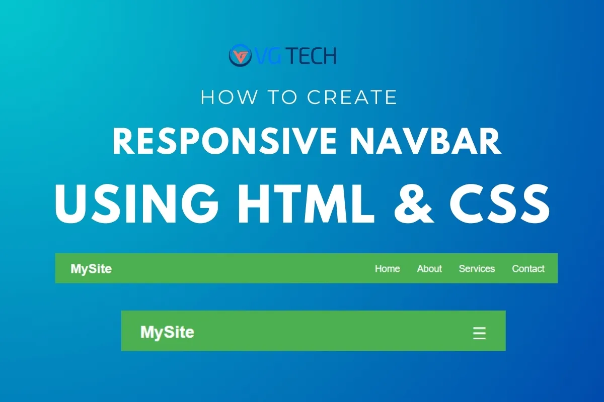
✅ Have clickable links (like Home, About, Contact)
✅ Look great on big and small screens
✅ Turn into a hamburger menu (🍔) on mobile phones
What You’ll Need
- A text editor (like VS Code, Notepad, or Replit)
- A web browser (Chrome, Firefox, or Safari)
- A sprinkle of creativity! ✨
Step 1: HTML Structure for Navbar
First, we’ll write the HTML—the skeleton of our navbar.
<!DOCTYPE html>
<html lang="en">
<head>
    <meta charset="UTF-8">
    <meta name="viewport" content="width=device-width, initial-scale=1.0">
    <title>My Awesome Navbar</title>
    <link rel="stylesheet" href="style.css">
</head>
<body>
    <nav class="navbar">
        <div class="logo">MySite</div>
        <ul class="nav-links">
            <li><a href="#">Home</a></li>
            <li><a href="#">About</a></li>
            <li><a href="#">Services</a></li>
            <li><a href="#">Contact</a></li>
        </ul>
        <div class="hamburger">☰</div>
    </nav>
</body>
</html>
What’s Happening Here?
<nav>: This is the container for our navbar..logo: A placeholder for your website’s name.<ul>: An unordered list for our navigation links..hamburger: This will show up on small screens (like phones).
Step 2: Styling the Navbar with CSS
Now, let’s make it look awesome with CSS! Create a file called style.css and add this:
* {
    margin: 0;
    padding: 0;
    box-sizing: border-box;
    font-family: Arial, sans-serif;
}

/* Navbar styles */
.navbar {
    display: flex;
    justify-content: space-between;
    align-items: center;
    background-color: #4CAF50;
    padding: 1rem 2rem;
    color: white;
}

.logo {
    font-size: 1.5rem;
    font-weight: bold;
}

.nav-links {
    display: flex;
    list-style: none;
    gap: 2rem;
}

.nav-links a {
    color: white;
    text-decoration: none;
    font-size: 1.1rem;
}

.nav-links a:hover {
    text-decoration: underline;
}

.hamburger {
    font-size: 1.5rem;
    cursor: pointer;
    display: none;
}

/* Media Query for Mobile Devices */
@media (max-width: 768px) {
    .nav-links {
        display: none;
        flex-direction: column;
        width: 100%;
        position: absolute;
        top: 60px;
        left: 0;
        background-color: #4CAF50;
        padding: 1rem 2rem;
        gap: 1rem;
    }

    .nav-links.active {
        display: flex;
    }

    .hamburger {
        display: block;
    }
}
What’s Happening Here?
- Flexbox Magic:
display: flexhelps align items side by side. - Hover Effect: Links get underlined when you hover over them.
- Mobile-Friendly: The
@mediaquery hides links on small screens and shows the hamburger (☰) instead.
Step 3: Adding JavaScript (Just a Tiny Bit!)
To make the hamburger menu work, we need a little JavaScript. Add this before </body> in your HTML:
<script>
    const hamburger = document.querySelector('.hamburger');
    const navLinks = document.querySelector('.nav-links');

    hamburger.addEventListener('click', () => {
        navLinks.classList.toggle('active');
    });
</script>
What’s Happening Here?
- When you click the ☰ button, it toggles the
.activeclass, making the menu appear/disappear.
Step 4: Testing Your Responsive Navbar with HTML and CSS
Open your HTML file in a browser. Try:
- Resizing the window – Watch the navbar turn into a hamburger menu!
- Clicking the hamburger – The menu should slide down.
Bonus: Make It Even Cooler!
Want to level up? Try these tweaks:
1. Smooth Animations
Add this to your CSS:
.nav-links {
    transition: all 0.3s ease;
}
2. Change Colors
Swap #4CAF50 (green) with your favorite color!
3. Add Icons
Use Font Awesome to add cool icons next to links.
Also Read: What is HTML? The Ultimate Beginner’s Guide (2025) – Start Coding Today!
Final Thoughts
Woohoo! 🎉 You just built a responsive navbar from scratch. Now you can:
- Use it in your own projects
- Customize colors, fonts, and animations
- Show it off to friends and family
Keep experimenting, and soon you’ll be a web design pro!
What’s Next?
- Try making a footer
- Learn about CSS Grid
- Build a whole website!
Got questions? abou How to Create a Responsive Navbar with HTML and CSS, Drop them in the comments below! 👇
Happy coding! 💻✨